The DFI Framework

The Digital Footprint Sites are loosely designed on the Storybrand framework. While not getting into the details of the details of the story brand marketing framework, there are two important considerations in crafting and engaging ministry web presence. First, how does your ministry help the visitor be the hero in his or her story and second, what is their first step in the journey toward herodom?
If you’ve got theology of glory red flags waiving in your head, there may be a good reason. When done poorly, Storybrand can lead someone to conclude that salvation is a matter of their work, their next step. However, that error is not built into the framework, it is the result of misunderstanding or misusing the Storybrand framework. When I raised the question, “How does your ministry help the visitor be the hero in his or her story, I wanted to challenge you to consider the needs that the visitor brings to your webpage. For example, how can your congregation help your visitor be a hero with their children, in their devotional life, in their desire to know God, or their efforts to deal with depression or disappointment? Too often it is assumed that people approach church seeking a means to gain material wealth, entertainment, or achieve some kind of worldly success. In reality, they generally don’t think the church can help them with their material problems; they don't have an expectation of entertainment from the church; they seek a church because they are looking for something more than they can get in this world. Perhaps they are facing challenges that are overwhelming. Perhaps they recognize that something is missing in their life and they want to see if it is something found in the church.
By connecting with their need, your congregation is able to form a valuable partnership with the guest. The role of the content is not to show them how they can solve their problems or answer their questions. The role of the content is to show them how your congregation enables them to take new steps in their spiritual journey and discover the God who created them.
In some ways this might seem like the old need-based evangelism of the 80’s and 90’s. Back then the slogan was “Find a need and fill it; find a hurt and heal it.” While well intentioned, that mentality created a powerful culture of consumerism with which the church continues to struggle. Equally harmful, for many Christians, it took the focus away from Jesus and put it on man. What I’m describing is different.
First, instead of offering answers or solutions, the congregation is inviting the visitor on a quest; a quest that leads them into the Word of God within the context of a theologically sound congregation. Second, the focus of the quest isn’t the solution to just any problem or any need, it is a quest that brings them into the presence of Christ. The goal is not to help them figure out how to get Jesus to give them stuff or solutions to their problems but that He might fundamentally reshape the way they see and interact with their world. Third, the quest is dependent upon their obedience to Christ, it is not dependent upon the churches ability to deliver promised goods. The side benefit of this last point is that the individual becomes dependent upon Christ, not the local congregation.
I want to walk through four website homepages to show you the contrast between a storybrand site and a traditional feature focused website. All four websites are well done and serve as examples of best design practices with their respective design frame. Finally I’ll walk through the content that is on our sample site and explain how it fits into the story brand framework.

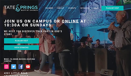
The first storybrand website that I will highlight is Tate Springs Baptist Church. You can see it at tatesprings.com. At the time of this writing, the background image for the frontpage landing was of a child deep in prayer. The central tagline of the website stated, “We help you discover your part in God’s Story.” You will notice that true to the story brand framework, that tagline puts the visitor in the position of hero. The hero’s quest is to find his part in God’s story. Secondly, it stated that the church was a trusted guide for the hero’s quest. The quest presented in the tagline reflects the design decision that a question or a concern that might move a person to come to this church is the question of God’s purpose for their life. The image of the praying child suggested that the website is focused on families who might be struggling with God’s presence or purpose for their family.
The page displayed two calls to action, two ways the visitor can begin their quest, “Come to a service” or “Listen to a sermon.” The website carried the quest imagery even farther as you scroll down and see a section titled, “4 Steps To Getting Started” The steps are sequential starting with step 1, Come to a service. Step 2, Visit the “Next Step” room after service. Step 3, Attend a Discovery Workshop, and step 4, Join & Start Making a Difference. I appreciate that this church as thought about the quest that they are proposing and have prepared a path that could guide someone from the point of considering faith to the point of being engaged in mission and ministry.

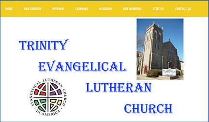
The second site I want to talk about is Trinity Evangelical Lutheran Church. At the time of this writing, the landing page featured its name and its mission tagline, "Together in Community, Living with Christ's Love, Caring for Our Neighbors." Tag lines are great for focusing ministry efforts of the members, but they remind the visitor that the church is the hero. That reminder reinforces that the guest's role is that of a consumer. While there is little content on the landing page to indicate a feature based approach to web design, the menu options across the top are focused on features of the ministry. Almost of the menus options opened to a list of programs and events that the church.

The third church I want to review is Risen Church, risenchurch.org. At the time of this writing, this website had a dramatic and engaging video background that loops. The video alternated between clips of places in the town and people praying or serving. The tagline stated, “A Safe Place to Explore your Faith.” In contrast to the other two sites, the tag line said little about the church. The role of the church as a guide was to provide safety so the hero, the guest, could quest to explore faith. The felt need that this church believed would bring people to visit the church was the need to explore the meaning and place of faith in their lives.
The front page contained one call to action, “Plan you visit.” When that option is selected it loaded a second page that focused on the various ways the congregation makes the congregation a safe place for the guest to explore faith.
This website stood out for what it doesn’t say or do. The front page contains the introductory video, the tagline, and a call to action. The only other item that is highlighted is the congregation’s service to the community. The website is extremely focused on one message. There are menus that give you other options. They include: “Plan your visit, About, Sermons, Community, Calendar, and Give.

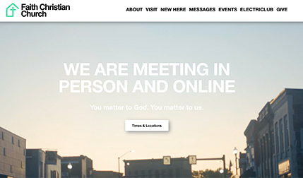
The final site that we will look at Faith Christian Church. At the time of this writing, it contained an engaging video background. In contrast to the community focus of the last video, this video presented the features of the church. There were clips of people talking in a fellowship gathering, the worship band, and the pastor preaching a sermon. The video background was consistent with a “Features” driven approach to website design. The tagline reads, “You matter to God. You Matter to us.” Notice that the visitor is the object of activity, the visitor is a passive recipient of care. Now I do appreciate that the church is making a promise that is within its capacity to deliver. The church can certainly ensure that its energies are focused on demonstrating their care and concern for the visitor. As stated earlier, this feeds a consumer mentality in the church. Rather than raising-up an active and engaging priesthood to declare the praises of Him who called us out of darkness, the church is raising up generations of consumers.
Scrolling down the page, the mission was the second tagline highlighted. It stated, “Bringing Jesus to All People.” A good mission tagline, but it puts the spotlight on the church as the hero. It is the church that is doing the work.
I hope that you can begin to get a clear image of the difference between a storybrand website and a traditional feature focused site. I would encourage you to look at your congregation’s website and answer the following questions:
- Who is the hero?
- Has a quest been presented? Is it a quest that is rooted in a felt need of the visitor?
- Is there a clear call to action?
- What unintended messages are we conveying with our content and images?

